How much data you need for machine learning?
Collecting data is not easy. A general saying in data mining is “the more data the better”, but sometimes collecting more data is expensive, or just not feasible. Therefore, it becomes very valuable to try and understand how data affects a performance of a model. If a model can learn well with 1000 data points, then why collect 1000 more?
Learning curves are one such tool that helps us do exactly that.
Learning curves
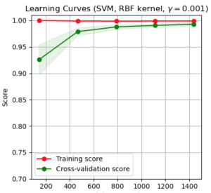
Learning curves show you how the performance of a classifier changes. Here is an example of a learning curve. This is example from scikit-learn’s implementation.
So, on this curve you can see both the training and the cross-validation score. The training score doesn’t change much by adding more examples. But the cross-validation score definitely does! You can see that once we reach about 1000-1200 examples there is very small change in performance.
So, what this tells us is that adding more examples over the ones we currently have is probably not required.
How can you use learning curves?
Learning curves are super easy to use through scikit-learn. Here is an example piece of code below:
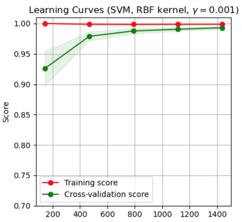
from sklearn.model_selection import learning_curve
from sklearn.svm import SVC
from sklearn.datasets import load_digits
from matplotlib import pyplot as plt
import numpy as np

X, y = load_digits(return_X_y=True)
estimator = SVC(gamma=0.001)

train_sizes, train_scores, test_scores, fit_times, _ = learning_curve(estimator, X, y, cv=30,return_times=True)

plt.plot(train_sizes,np.mean(train_scores,axis=1))
This will plot a curve like the one below:
Here we have used the default setting of splitting up the data in 5 groups. In this case we have used the default train size split which is [0.1, 0.33, 0.55, 0.78, 1.0].
Note two things.
First, we have to call np.mean(train_scores,axis=1) before we plot. Why is this? If we print train_score then we see that it is a matrix, with a number of rows equal to the number of cross-validation iterations we used. So, we have to take the mean across all folds before we plot it.
Second, note that the function also returns fit_times. This returns the time it took to fit the model. As you can expect, the more data the longer it takes to run the model. If we get the mean running time for each one of the data samples.
array([0.8336064 , 0.96932203, 0.98043315, 0.9843597 , 0.98886064])
On scikit-learn’s website you can also find a very nice piece of code that will create a very nice plot for you.
Learning curves
So, next time you are not sure whether you need to find more data or not, you know which tool to use! Scikit-learn makes learning curves very easy to use, and can help you make an objective cost-benefit analysis, as to how to proceed with data collection. Make sure to add this technique as a staple in your machine learning arsenal!
Do you want to become data scientist?

Do you want to become a data scientist and pursue a lucrative career with a high salary, working from anywhere in the world? I have developed a unique course based on my 10+ years of teaching experience in this area. The course offers the following:
- Learn all the basics of data science (value $10k+)
- Get premium mentoring (value at $1k/hour)
- We apply to jobs for you and we help you land a job, by preparing you for interviews (value at $50k+ per year)
- We provide a satisfaction guarantee!
If you want to learn more book a call with my team now or get in touch.