
Machine learning is a fast-growing technology that allows computers to learn from the past and predict the future. It uses numerous algorithms for building mathematical models and predicting future trends. Machine learning (ML) has widespread applications in the industry, including speech recognition, image recognition, churn prediction, email filtering, chatbot development, recommender systems, and much more.
Machine learning (ML) can be classified into three main categories; supervised, unsupervised, and reinforcement learning. In supervised learning, the model is trained on labeled data. While in unsupervised learning, unlabeled data is provided to the model to predict the outcomes. Reinforcement learning is feedback learning in which the agent collects a reward for each correct action and gets a penalty for a wrong decision. The goal of the learning agent is to get maximum reward points and deduce the error.
This machine learning tutorial provides you with a practical guide to the implementation of unsupervised algorithms in Python. Moreover, you will get familiarized with the commonly used clustering, association, and dimensionality reduction techniques.
What is Unsupervised Learning?
In unsupervised learning, the model learns from unlabeled data without proper supervision.
Unsupervised learning uses machine learning techniques to cluster unlabeled data based on similarities and differences. The unsupervised algorithms discover hidden patterns in data without human supervision. Unsupervised learning aims to arrange the raw data into new features or groups together with similar patterns of data.
For instance, to predict the churn rate, we provide unlabeled data to our model for prediction. There is no information given that customers have churned or not. The model will analyze the data and find hidden patterns to categorize into two clusters: churned and non-churned customers.
Unsupervised Learning Approaches
Unsupervised algorithms can be used for three tasks—clustering, dimensionality reduction, and association. Below, we will highlight some commonly used clustering and association algorithms.
Clustering Techniques
Clustering, or cluster analysis, is a popular data mining technique for unsupervised learning. The clustering approach works to group non-labeled data based on similarities and differences. Unlike supervised learning, clustering algorithms discover natural groupings in data.
A good clustering method produces high-quality clusters having high intra-class similarity (similar data within a cluster) and less intra-class similarity (cluster data is dissimilar to other clusters).
It can be defined as the grouping of data points into various clusters containing similar data points. The same objects remain in the group that has fewer similarities with other groups. Here, we will discuss two popular clustering techniques: K-Means clustering and DBScan Clustering.
- K-Means Clustering
K-Means is the simplest unsupervised technique used to solve clustering problems. It groups the unlabeled data into various clusters. The K value defines the number of clusters you need to tell the system how many to create.
K-Means is a centroid-based algorithm in which each cluster is associated with the centroid. The goal is to minimize the sum of the distances between the data points and their corresponding clusters.
It is an iterative approach that breaks down the unlabeled data into different clusters so that each data point belongs to a group with similar characteristics.
K-means clustering performs two tasks:
- Using an iterative process to create the best value of K.
- Each data point is assigned to its closest k-center. The data point that is closer to the particular k-center makes a cluster.
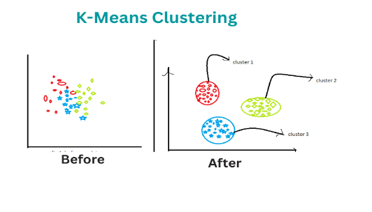
An illustration of K-means clustering. Image source
- DBScan Clustering
“DBScan” stands for “Density-based spatial clustering of applications with noise.” There are three main words in DBscan: density, clustering, and noise. Therefore, this algorithm uses the notion of density-based clustering to form clusters and detect the noise.
Clusters are usually dense regions that are separated by lower density regions. Unlike the k-means algorithm, which works only on well-separated clusters, DBscan has a wider scope and can create clusters within the cluster. It discovers clusters of various shapes and sizes from a large set of data, which consists of noise and outliers.
There are two parameters in the DBScan algorithm:
minPts: The threshold, or the minimum number of points grouped together for a region considered as a dense region.
eps(ε): The distance measure used to locate the points in the neighborhood.
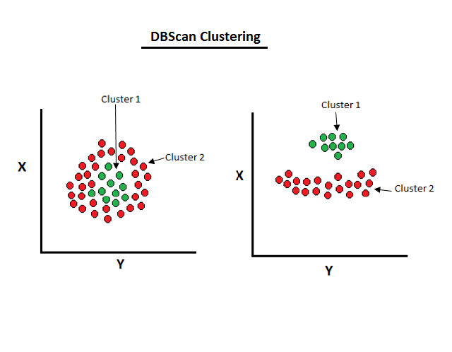
An illustration of density-based clustering. Image Source
Association Rule Mining
An association rule mining is a popular data mining technique. It finds interesting correlations in large numbers of data items. This rule shows how frequently items occur in a transaction.
Market Basket Analysis is a typical example of an association rule mining that finds relationships between items in the grocery store. It enables retailers to identify and analyze the associations between items that people frequently buy.
Important terminology used in association rules:
Support: It tells us about the combination of items bought frequently or frequently bought items.
Confidence: It tells us how often the items A and B occur together, given the number of times A occurs.
Lift: The lift indicates the strength of a rule over the random occurrence of A and B. For instance, A->B, the life value is 5. It means that if you buy A, the occurrence of buying B is five times.
The Apriori algorithm is a well-known association rule based technique.
- Apriori algorithm
The Apriori algorithm was proposed by R. Agarwal and R. Srikant in 1994 to find the frequent items in the dataset. The algorithm’s name is based on the fact that it uses prior knowledge of frequently occurring things.
The Apriori algorithm finds frequently occurring items with minimum support.
It consists of two steps:
- Generation of candidate itemsets.
- Removing items that are infrequent and don’t fulfill the criteria of minimum support.
Practical Implementation of Unsupervised Algorithms
In this tutorial, you will learn about the implementation of various unsupervised algorithms in Python. Scikit-learn is a powerful Python library widely used for various unsupervised learning tasks. It is an open-source library that provides numerous robust algorithms, which include classification, dimensionality reduction, clustering techniques, and association rules.
Let’s begin!
1. K-Means algorithm
Now let’s dive deep into the implementation of the K-Means algorithm in Python. We’ll break down each code snippet so that you can understand it easily.
Import libraries
First of all, we will import the required libraries and get access to the functions.
#Let's import the required libraries
import numpy as np
import pandas as pd
import matplotlib.pyplot as plt
import seaborn as sns
Loading the dataset
The dataset is taken from the kaggle website. You can easily download it from the given link. To load the dataset, we use the pd.read_csv() function. head() returns the first five rows of the dataset.
my_data = pd.read_csv('Customers_Mall.csv.')
my_data.head()
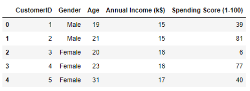
The dataset contains five columns: customer ID, gender, age, annual income in (K$), and spending score from 1-100.
Data Preprocessing
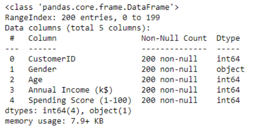
The info() function is used to get quick information about the dataset. It shows the number of entries, columns, total non-null values, memory usage, and datatypes.
my_data.info()
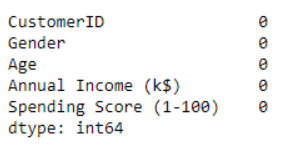
To check the missing values in the dataset, we use isnull().sum(), which returns the total number of null values.
#Check missing values
my_data.isnull().sum()
The box plot or whisker plot is used to detect outliers in the dataset. It also shows a statistical five number summary, which includes the minimum, first quartile, median (2nd quartile), third quartile, and maximum.
my_data.boxplot(figsize=(8,4))
Using Box Plot, we’ve detected an outlier in the annual income column. Now we will try to remove it before training our model.
#let's remove outlier from data
med =61
my_data["Annual Income (k$)"] = np.where(my_data["Annual Income (k$)"] >
 120,med,my_data['Annual Income (k$)'])
The outlier in the annual income column has been removed now to confirm we used the box plot again.
my_data.boxplot(figsize=(8,5))
Data Visualization
A histogram is used to illustrate the important features of the distribution of data. The hist() function is used to show the distribution of data in each numerical column.
my_data.hist(figsize=(6,6))
The correlation heatmap is used to find the potential relationships between variables in the data and to display the strength of those relationships. To display the heatmap, we have used the seaborn plotting library.
plt.figure(figsize=(10,6))
sns.heatmap(my_data.corr(), annot=True, cmap='icefire').set_title('seaborn')
plt.show()
Choosing the Best K Value
The iloc() function is used to select a particular cell of the data. It enables us to select a value that belongs to a specific row or column. Here, we’ve chosen the annual income and spending score columns.
X_val = my_data.iloc[:, 3:].values

X_val
# Loading Kmeans Library

from sklearn.cluster import KMeans
Now we will select the best value for K using the Elbow’s method. It is used to determine the optimal number of clusters in K-means clustering.
my_val = []

for i in range(1,11):

    kmeans = KMeans(n_clusters = i, init='k-means++', random_state = 123)

    kmeans.fit(X_val)

    my_val.append(kmeans.inertia_)
The sklearn.cluster.KMeans() is used to choose the number of clusters along with the initialization of other parameters. To display the result, just call the variable.
my_val
#Visualization of clusters using elbow’s method

plt.plot(range(1,11),my_val)

plt.xlabel('The No of clusters')

plt.ylabel('Outcome')

plt.title('The Elbow Method')

plt.show()
Through Elbow’s Method, when the graph looks like an arm, then the elbow on the arm is the best value of K. In this case, we’ve taken K=3, which is the optimal value for K.
kmeans = KMeans(n_clusters = 3, init='k-means++')

kmeans.fit(X_val)


#To show centroids of clusters

kmeans.cluster_centers_


#Prediction of K-Means clustering

y_kmeans = kmeans.fit_predict(X_val)

y_kmeans
Splitting the dataset into three clusters
The scatter graph is used to plot the classification results of our dataset into three clusters.
plt.scatter(X_val[y_kmeans == 0,0], X_val[y_kmeans == 0,1], c='red',s=100)

plt.scatter(X_val[y_kmeans == 1,0], X_val[y_kmeans == 1,1], c='green',s=100)

plt.scatter(X_val[y_kmeans == 2,0], X_val[y_kmeans == 2,1], c='orange',s=100)

plt.scatter(kmeans.cluster_centers_[:,0], kmeans.cluster_centers_[:,1], s=300, c='brown')

plt.title('K-Means Unsupervised Learning')

plt.show()
2. Apriori Algorithm
To implement the apriori algorithm, we will utilize “The Bread Basket” dataset. The dataset is available on Kaggle and you can download it from the link. This algorithm suggests products based on the user’s purchase history. Walmart has greatly utilized the algorithm to recommend relevant items to its users.
Let’s implement the Apriori algorithm in Python.
Import libraries
To implement the algorithm, we need to import some important libraries.
import pandas as pd

import matplotlib.pyplot as plt

import numpy as np

import seaborn as sns
Loading the dataset
The dataset contains five columns and 20507 entries. The data_time is a prominent column and we can extract many vital insights from it.
my_data= pd.read_csv("bread basket.csv")

my_data.head()
Data Preprocessing
Convert the data_time into an appropriate format.
my_data['date_time'] = pd.to_datetime(my_data['date_time'])

#Total No of unique customers

my_data['Transaction'].nunique()
Now we want to extract new columns from the data_time to extract meaningful information from the data.
#Let's extract date

my_data['date'] = my_data['date_time'].dt.date

#Let's extract time

my_data['time'] = my_data['date_time'].dt.time

#Extract month and replacing it with String

my_data['month'] = my_data['date_time'].dt.month

my_data['month'] = my_data['month'].replace((1,2,3,4,5,6,7,8,9,10,11,12),

                                          ('Jan','Feb','Mar','Apr','May','Jun','Jul','Aug',

                                          'Sep','Oct','Nov','Dec'))
#Extract hour
my_data[‘hour’] = my_data[‘date_time’].dt.hour
# Replacing hours with text
# Replacing hours with text
hr_num = (1,7,8,9,10,11,12,13,14,15,16,17,18,19,20,21,22,23)
hr_obj = (‘1-2′,’7-8′,’8-9′,’9-10′,’10-11′,’11-12′,’12-13′,’13-14′,’14-15’,
’15-16′,’16-17′,’17-18′,’18-19′,’19-20′,’20-21′,’21-22′,’22-23′,’23-24′)
my_data[‘hour’] = my_data[‘hour’].replace(hr_num, hr_obj)
# Extracting weekday and replacing it with String
my_data[‘weekday’] = my_data[‘date_time’].dt.weekday
my_data[‘weekday’] = my_data[‘weekday’].replace((0,1,2,3,4,5,6),
(‘Mon’,’Tues’,’Wed’,’Thur’,’Fri’,’Sat’,’Sun’))
#Now drop date_time column
my_data.drop(‘date_time’, axis = 1, inplace = True)
After extracting the date, time, month, and hour columns, we dropped the data_time column.
Now to display, we simply use the head() function to see the changes in the dataset.
my_data.head()
# cleaning the item column
my_data[‘Item’] = my_data[‘Item’].str.strip()
my_data[‘Item’] = my_data[‘Item’].str.lower()
my_data.head()
Data Visualization
To display the top 10 items purchased by customers, we used a barplot() of the seaborn library.
plt.figure(figsize=(10,5))

sns.barplot(x=my_data.Item.value_counts().head(10).index, y=my_data.Item.value_counts().head(10).values,palette='RdYlGn')

plt.xlabel('No of Items', size = 17)

plt.xticks(rotation=45)

plt.ylabel('Total Items', size = 18)

plt.title('Top 10 Items purchased', color = 'blue', size = 23)

plt.show()
From the graph, coffee is the top item purchased by the customers, followed by bread.
Now, to display the number of orders received each month, the groupby() function is used along with barplot() to visually show the results.
mon_Tran =my_data.groupby('month')['Transaction'].count().reset_index()

mon_Tran.loc[:,"mon_order"] =[4,8,12,2,1,7,6,3,5,11,10,9]

mon_Tran.sort_values("mon_order",inplace=True)


plt.figure(figsize=(12,5))

sns.barplot(data = mon_Tran, x = "month", y = "Transaction")

plt.xlabel('Months', size = 14)

plt.ylabel('Monthly Orders', size = 14)

plt.title('No of orders received each month', color = 'blue', size = 18)

plt.show()
To show the number of orders received each day, we applied groupby() to the weekday column.
wk_Tran = my_data.groupby('weekday')['Transaction'].count().reset_index()

wk_Tran.loc[:,"wk_ord"] = [4,0,5,6,3,1,2]

wk_Tran.sort_values("wk_ord",inplace=True)

plt.figure(figsize=(11,4))

sns.barplot(data = wk_Tran, x = "weekday", y = "Transaction",palette='RdYlGn')

plt.xlabel('Week Day', size = 14)

plt.ylabel('Per day orders', size = 14)

plt.title('Orders received per day', color = 'blue', size = 18)

plt.show()
Implementation of the Apriori Algorithm
We import the mlxtend library to implement the association rules and count the number of items.
from mlxtend.frequent_patterns import association_rules, apriori

tran_str= my_data.groupby(['Transaction', 'Item'])['Item'].count().reset_index(name ='Count')

tran_str.head(8)
Now we’ll make a mxn matrix where m=transaction and n=items, and each row represents whether the item was in the transaction or not.
Mar_baskt = tran_str.pivot_table(index='Transaction', columns='Item', values='Count', aggfunc='sum').fillna(0)

Mar_baskt.head()
We want to make a function that returns 0 and 1. 0 means that the item wasn’t present in the transaction, while 1 means the item exists.
def encode(val):

    if val<=0:

        return 0

    if val>=1:

        return 1

#Let's apply the function to the dataset

Basket=Mar_baskt.applymap(encode)

Basket.head()


#using apriori algorithm to set min_support 0.01 means 1%

freq_items = apriori(Basket, min_support = 0.01,use_colnames = True)

freq_items.head()
Using the association_rules() function to generate the most frequent items from the dataset.
App_rule= association_rules(freq_items, metric = "lift", min_threshold = 1)

App_rule.sort_values('confidence', ascending = False, inplace = True)

App_rule.head()
From the above implementation, the most frequent items are coffee and toast, both having a lift value of 1.47 and a confidence value of 0.70.
3. Principal Component Analysis
Principal component analysis (PCA) is one of the most widely used unsupervised learning techniques. It can be used for various tasks, including dimensionality reduction, information compression, exploratory data analysis and Data de-noising.
Let’s use the PCA algorithm!
First we import the required libraries to implement this algorithm.
import numpy as np

import pandas as pd

import matplotlib.pyplot as plt

import seaborn as sns

%matplotlib inline

from sklearn.decomposition import PCA

from sklearn.datasets import load_digits
Loading the Dataset
To implement the PCA algorithm the load_digits dataset of Scikit-learn is used which can easily be loaded using the below command. The dataset contains images data which include 1797 entries and 64 columns.
#Load the dataset

my_data= load_digits()

#Creating features

X_value = my_data.data

#Creating target

#Let's check the shape of X_value

X_value.shape
#Each image is 8x8 pixels therefore 64px

my_data.images[10]


#Let's display the image

plt.gray()

plt.matshow(my_data.images[34])

plt.show()
Now let’s project data from 64 columns to 16 to show how 16 dimensions classify the data.
X_val = my_data.data

y_val = my_data.target

my_pca = PCA(16)

X_projection = my_pca.fit_transform(X_val)

print(X_val.shape)

print(X_projection.shape)
Using colormap we visualize that with only ten dimensions we can classify the data points. Now we’ll select the optimal number of dimensions (principal components) by which data can be reduced into lower dimensions.
plt.scatter(X_projection[:, 0], X_projection[:, 1], c=y_val, edgecolor='white',

            cmap=plt.cm.get_cmap("gist_heat",12))

plt.colorbar();


pca=PCA().fit(X_val)

plt.plot(np.cumsum(my_pca.explained_variance_ratio_))

plt.xlabel('Principal components')

plt.ylabel('Explained variance')

Based on the below graph, only 12 components are required to explain more than 80% of the variance which is still better than computing all the 64 features. Thus, we’ve reduced the large number of dimensions into 12 dimensions to avoid the dimensionality curse.
pca=PCA().fit(X_val)

plt.plot(np.cumsum(pca.explained_variance_ratio_))

plt.xlabel('Principal components')

plt.ylabel('Explained variance')


#Let's visualize how it looks like

Unsupervised_pca = PCA(12)

X_pro = Unsupervised_pca.fit_transform(X_val)

print("New Data Shape is =>",X_pro.shape)

#Let's Create a scatter plot

plt.scatter(X_pro[:, 0], X_pro[:, 1], c=y_val, edgecolor='white',

            cmap=plt.cm.get_cmap("nipy_spectral",10))

plt.colorbar();
Wrapping Up
In this machine learning tutorial, we’ve implemented the Kmeans, Apriori, and PCA algorithms. These are some of the most widely used algorithms, having numerous industrial applications and solve many real world problems. For instance, K-means clustering is used in astronomy to study stellar and galaxy spectra, solar polarization spectra, and X-ray spectra. And, Apriori is used by retail stores to optimize their product inventory.
Dreaming of becoming a data scientist or data analyst even without a university and a college degree? Do you need the knowledge of data science and analysis for promotions in your current role?
Are you interested in securing your dream job in data science and analysis and looking for a way to get started, we can help you? With over 10 years of experience in data science and data analysis, we will teach you the rubrics, guiding you with one-on-one lessons from the fundamentals until you become a pro.
Our courses are affordable and easy to understand with numerous exercises and assignments you can learn from. At the completion of our courses, you’ll be readily equipped with technical and practical skills to take on any data science and data analysis role in companies, collaborate effectively among teams and help businesses meet and exceed their objectives by extracting actionable insights from data.
Start your journey in data science and data analysis today by viewing our free webinar.