Figure 1 Image Source: Blue Willow AI
In today’s data-driven world, effective data visualization is more important than ever. Choropleth mapping is a powerful technique that can help you unlock insights and communicate complex information in an intuitive way. In this article, we will explore the power of choropleth mapping in R, a popular programming language and software environment for statistical computing and graphics. We will cover everything from getting started with R to advanced techniques and best practices for creating stunning choropleth maps.
Introduction to Choropleth Mapping in R
What is Choropleth Mapping?
Choropleth mapping is a technique used in cartography to represent data through the use of colors or patterns on a map. This method is particularly useful for visualizing spatial data, such as population density or election results. Choropleth maps use different shades or colors to represent the values of a specific variable in different geographical areas, making it easy to identify patterns and trends at a glance.
Why use Choropleth Mapping for Data Visualization?
There are several reasons why choropleth mapping is a popular choice for data visualization:
- Intuitive: Choropleth maps are easy to read and understand, even for those who are not familiar with the underlying data. By using colors or patterns to represent data, the viewer can quickly grasp the spatial distribution and relationship between different values.
- Flexible: Choropleth mapping can be used to visualize a wide range of data types, from continuous variables like population density to categorical data like election results or land use.
- Scalable: Choropleth maps can be created at various levels of granularity, from global to local scales, allowing for a detailed examination of the data.
- Customizable: With the right tools and techniques, choropleth maps can be easily customized to suit your specific needs and preferences, making them an incredibly versatile tool for data visualization.
Getting started with R for Choropleth Mapping
Installing and loading necessary R packages
Before we can begin creating choropleth maps in R, we need to install and load the necessary packages. The following packages are essential for working with spatial data and creating choropleth maps in R:
- sf: Provides support for reading, writing, and manipulating spatial data in R.
- ggplot2: A powerful and flexible plotting package for creating professional-quality graphics.
- reshape2: An excellent package for data wrangling.
To install these packages, simply run the following commands in your R console:
install.packages("sf")
install.packages("ggplot2")
install.packages("reshape2")
Once the packages are installed, load them into your R workspace using the library() function:
library(sf)
library(ggplot2)
library(reshape2)
Preparing your data for Choropleth Mapping in R
To create a choropleth map in R, you will need two main components: spatial data and attribute data. Spatial data refers to the geographical boundaries of the areas you want to visualize, whereas attribute data contains the values you want to represent on the map.
Shapefiles provide all the necessary spatial data for the rendering of maps. These can be downloaded directly from official Government websites or other sources on the web.
For this example, I will use the shapefile provided by Eurostat found here. The file format should be SHP and you can choose any scale you wish. I recommend downloading the most recent country borders, but any should work fine.
Next, you will need to prepare your attribute data. For this example, we will be using the World Bank population example dataset contained within R. This following code will filter out the variable of interest as well as the year. The melt function will immediately transform the data frame from wide to long format, making it compatible with the data structure contained within the shapefile.
data("world_bank_pop")
pop <- world_bank_pop %>%
filter(indicator == "SP.POP.TOTL")
pop <- melt(pop)
pop <- pop %>%
select(ISO3_CODE = country , year = variable , pop = value) %>%
filter(year == "2000")
Step-by-step guide to creating Choropleth Maps in R
Now that your attribute data is prepared, we can begin creating choropleth maps in R. In this section, we will provide a step-by-step guide to creating a basic choropleth map using the sf package.
- Set up the map: To start, create a new map object using the read_sf() command. The command required specifying the location of the data source name (where your downloaded file is located), and the name of the layer.
In our case this is:
map <- read_sf(dsn = "C:/Users/ … /ref-countries-2020- 03m.shp/CNTR_RG_03M_2020_3857.shp", layer = "CNTR_RG_03M_2020_3857")
- Merge the spatial and attribute data: Create a new object by merging both “pop” and “map”. This new object is called “ready”:
ready <- left_join(map , pop)
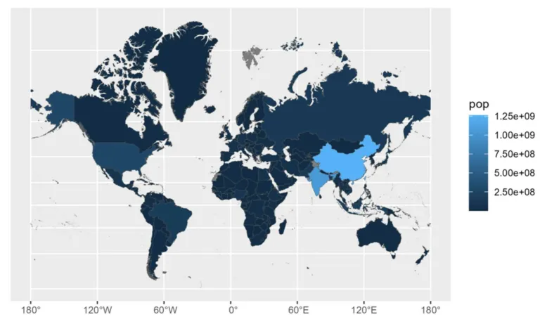
- Use ggplot2 to display the map: Use “ggplot2” to call the merged data and define the attribute data using aes(). Also, use “geom_sf” to control the characteristics of the map, such as the size of the border lines. Here Antarctica is excluded to make the map more readable:
map <- ggplot(data = ready[!ready$CNTR_NAME == "Antarctica",] , aes(fill = pop) ) +
geom_sf()
- Display the map: Finally, display your choropleth map by simply calling the map
Customizing your Choropleth Map for better visualization
The sf package provides a wide range of options for customizing your choropleth map to improve its appearance and readability. Some common customizations include:
- Changing border line size: You can adjust the border line size by simply adding size = inside of geom_sf(). The default is 0.5, but you can adjust it to your needs.
- Modfying the legend: Use the theme() function to change the position of the legend, modify the size, title and even the coloring.
- Adding a title and other text elements: Enhance your map with a title using functions such as ggtitle().
Troubleshooting common issues in Choropleth Mapping
As with any data visualization technique, you may encounter issues when creating choropleth maps in R. Some common problems and their solutions include:
- Missing or incorrect data: Always double-check your data for errors, such as missing values or incorrect identifiers. You can use R functions such as summary() and head() to inspect your data.
- Inconsistent color schemes: To ensure that your map is readable and visually appealing, be consistent with your color scheme and make sure that it accurately represents the data.

Figure 2 Source: Willow AI
Advanced techniques and best practices for Choropleth Mapping in R
Once you have mastered the basics of choropleth mapping in R, you can explore more advanced techniques and best practices to create even more effective visualizations. Here are some tips to get you started:
- Use multiple variables: Consider using multiple variables in your choropleth map to show how different variables relate to each other geographically. For example, you could overlay a choropleth map of population density with a second choropleth map showing median income levels.
- Create interactive maps: R provides several packages, such as leaflet, mapview, and shiny, that allow you to create interactive maps that viewers can explore and interact with. This can help viewers gain a deeper understanding of the data and uncover patterns that may not be immediately apparent.
- Consider spatial autocorrelation: Spatial autocorrelation refers to the tendency of data values in neighboring areas to be more similar than those in distant areas. When creating choropleth maps, it is important to account for spatial autocorrelation by using appropriate statistical techniques, such as spatial regression models or spatial clustering algorithms.
- Choose appropriate classification methods: The method you use to classify your data can have a significant impact on the appearance and interpretation of your choropleth map. Consider using methods such as “equal interval” or “jenks” to create more visually appealing and informative maps.
Conclusion and next steps for mastering Choropleth Mapping in R
Choropleth mapping is a powerful tool for visualizing spatial data and uncovering patterns and trends that may not be immediately apparent. With R, you can create professional-quality choropleth maps that are fully customizable and scalable to any level of detail.
In this article, we have covered the basics of choropleth mapping in R, including how to install the necessary packages, prepare your data, and create a basic choropleth map. We have also provided tips for customizing your map, troubleshooting common issues, and exploring more advanced techniques and best practices.
To continue mastering choropleth mapping in R, we recommend exploring additional resources, such as online tutorials, documentation, and user forums. With practice and experimentation, you can create choropleth maps that effectively communicate even the most complex spatial data.
Unlock the Power of Data Science with Our Courses and Services!
Are you ready to unlock the power of choropleth mapping in R and take your data visualization skills to the next level? At The Data Scientist, we offer comprehensive data science courses and services designed to help you master the art of effective data visualization.
In today’s data-driven world, being able to communicate complex information in an intuitive way is crucial. Choropleth mapping is a powerful technique that allows you to visualize spatial data and uncover patterns and trends with ease. Whether you’re interested in representing population density, election results, or any other geographical variable, our courses and services will equip you with the knowledge and skills you need.
Our data science courses provide step-by-step techniques for creating stunning choropleth maps in R. From getting started with the necessary packages to advanced customization and troubleshooting, we cover it all. Our experienced instructors will guide you through the process, ensuring that you grasp the concepts and gain hands-on experience.
If you’re looking for professional data science services,
our team of experts is ready to assist you. Whether you need help preparing your data, creating customized choropleth maps, or optimizing your visualizations for maximum impact, we have the expertise to deliver outstanding results. We understand the importance of accurate and visually appealing data visualization, and we’ll work closely with you to meet your specific needs and preferences.
Don’t miss out on the opportunity to unlock the power of data visualization with choropleth mapping in R. Enroll in our data science courses or leverage our expert services today. Visit our website or contact us at [Your Contact Information] to get started on your data science journey. Let’s harness the potential of data together!

