Creating visually stunning websites with a minimalist design is more than just a trend; it’s a philosophy that prioritizes functionality and aesthetic simplicity. This approach strips away the excess, focusing on essential elements to create a serene and direct user experience. Minimalist design is not about the absence of elements but about the perfect balance and alignment of them, ensuring that every part serves a purpose.
Embrace White Space
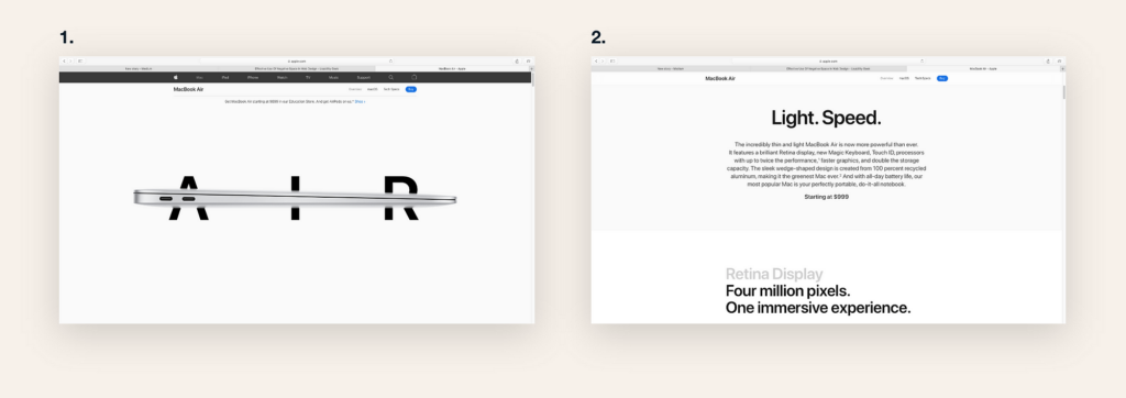
White space, often referred to as negative space, is the foundation of minimalist design. It’s not merely empty space but a powerful tool that helps in guiding the users’ focus. By accepting white space as part of the design, it allows the most crucial parts of a website to be highlighted, making them immediately apparent to visitors. This approach simplifies the user interface, making it more navigable and less overwhelming. To effectively use white space, start by decluttering your layout. Focus on the essentials and allow each element room to breathe. This makes your website look cleaner and also significantly enhances user engagement.
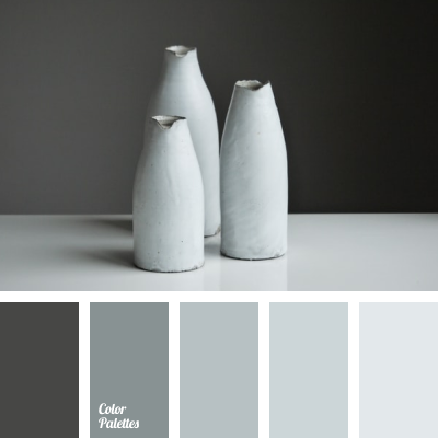
Use a Monochrome or Limited Color Palette
Color plays a pivotal role in web design, influencing both the aesthetic appeal and the user’s emotional response. Minimalist websites often leverage a monochrome or limited color palette to create harmony and balance. Choosing a restrained color scheme doesn’t mean your design has to be boring. Instead, it can bring a sophisticated and elegant look to your website. Select colors that reflect your brand’s identity and use them consistently throughout the site. A pop of accent color can be effective for call-to-action buttons or important links, drawing attention without cluttering the design.
Optimize Digital Assets for Minimalist Design
In minimalist design, managing digital assets effectively is essential. Every image, video, or graphic must serve a purpose and align with the overall design ethos. Optimize your digital assets to ensure they complement the minimalist aesthetic. This means selecting high-quality images that convey your message without overwhelming the viewer and using compression tools to reduce file sizes without sacrificing clarity. Efficiently managing these assets helps maintain a clean, focused layout that enhances the user experience while adhering to minimalist principles.
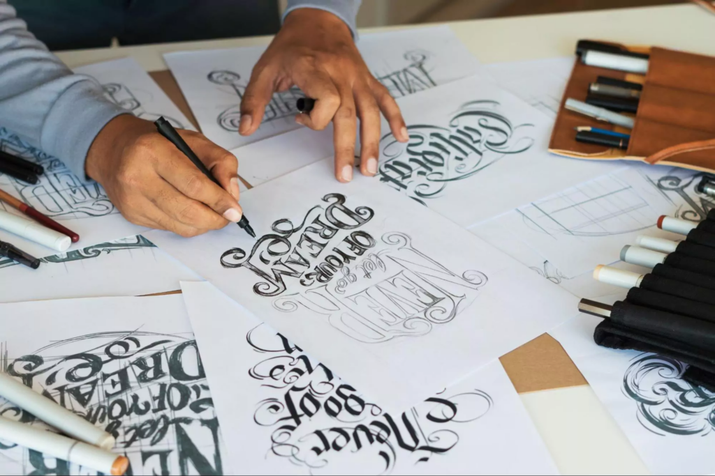
Choose Typography That Speaks
The fonts you choose can significantly impact the look and feel of your site. Opt for typography that aligns with minimalist design—simple, readable, and impactful. A well-chosen font can convey your brand’s personality while enhancing the overall design. Keep in mind that in a minimalist setup, less is often more. Stick to a limited typography palette to maintain coherence and elegance.
Prioritize Content Hierarchy
With fewer elements on the page, organizing content becomes essential to guide the user through your site intuitively. Use headings, subheadings, and bullet points to structure your information clearly and logically. Emphasize key points through bold or italic styles sparingly to draw attention without overwhelming the design. Effective content hierarchy like this ensures that users can easily find what they’re looking for, making their journey through your site as seamless as possible.
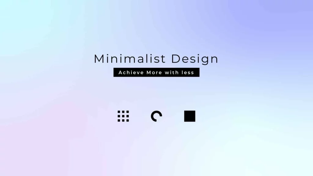
Implement Iconography
Icons are a minimalist designer’s best friend. They convey information and functionality in a visually simple and direct manner. When text is minimized, icons step in to guide users, acting as universal cues that speed up navigation and comprehension. Choose icons that are easily recognizable and consistent in style to maintain a coherent visual language across your website. Implementing iconography effectively reduces the need for text, keeping your design clean and focused.
Focus on Navigation Clarity
In a minimalist layout, every navigation element must be deliberate and functional, guiding users effortlessly through the site. Simplify your menu by consolidating similar pages and utilizing dropdowns sparingly to avoid overwhelming users with choices. Employ a fixed or sticky navigation bar that remains accessible as users scroll, ensuring they can easily move between sections without confusion. The goal is to enhance the user experience by making it straightforward for visitors to find what they need with minimal clicks.
Incorporate Ample Negative Space
Beyond white space around text and titles, negative space should envelop every element on your page, from images to call-to-action buttons. This space is not merely empty; it’s a critical component that contributes to the overall balance and beauty of the design. It allows each component to stand out, ensuring users are not bombarded with information but rather can appreciate each element in turn. Use negative space to create a rhythm and flow that guides the user’s eye across the page, making the experience visually appealing and enjoyable.
Simplify User Interactions
In minimalist web design, simplicity extends to the way users interact with your site. This means rethinking traditional forms, buttons, and interaction patterns. Design forms with as few fields as necessary, asking only for essential information to reduce user effort. For call-to-action buttons, clarity and visibility are key. Use contrasting colors from your limited palette to make them stand out, and keep the copy direct and straightforward. Hover effects, subtle animations, or micro-interactions can add a layer of engagement without complicating the design. These elements should enhance the user experience, making interactions not just simple but satisfying.
Test and Refine
The minimalist design is an iterative process. What works in theory may not always translate perfectly in practice. Regular testing and refinement are crucial to understanding how users interact with your design. Use A/B testing to experiment with different elements, from navigation structures to call-to-action placements. Collect user feedback to identify areas for improvement. This ongoing process ensures that your minimalist design remains visually appealing, highly functional, and user-friendly.
The Art of Less is More
Creating visually stunning websites with minimalist design is an art that emphasizes simplicity, functionality, and elegance. By adopting principles such as clear navigation, high-quality imagery, and ample negative space, designers can craft experiences that captivate and engage users. However, continuous testing and refinement are essential to maintain the delicate balance between minimalism and functionality. When executed well, minimalist web design can elevate the user experience to new heights.
Ready to elevate your skills and lead with cutting-edge technology?
The Tesseract Academy offers education, consulting, and implementation services tailored for non-technical decision-makers like you. Whether you’re an entrepreneur, a leader, a manager, or someone intrigued by AI or blockchain without technical expertise, the Tesseract Academy is your gateway. Enhance your skills with our comprehensive data science courses, specifically designed for non-technical professionals. Take the first step towards mastering AI, data science, and blockchain technologies today!