If you compare ten successful websites from different industries, you will notice one common point between them: Navigation. How effectively your web design flows from one page to another has a significant impact on your user experience. That is why experts take enough time to create a website that strikes the right chord with your users.
So, how can you ensure seamless navigation for your website design in Melbourne? The answer needs to be tailored a bit to your needs. However, the following 8 latest trends will help you get the right inspiration.
Let’s start with the most basic and evergreen trend.
1. Simplified Navigation
The basics will never go wrong. So, when in doubt, it’s best to go back to the basic and minimal web design. This lets users feel familiar with your websites and find what they need quickly without a second thought. But what does it mean to simplify the navigation?
For starters, reduce the number of links/tabs on the navigational menu. Often, we see websites with more than ten tabs, and it doesn’t give a good impression to your visitors. So, keep it minimal; perhaps five to seven at the maximum. If necessary, you can try the drop-down feature and organise the items cleverly.

2. Animate Hover Effect
Though many websites are using this feature, many still don’t know how to take full advantage of it. It’s either avoided entirely or underused. Instead, study how to use the hover effect in a way that elevates your entire website experience.
The biggest benefit of using the hover effect is that your user feels a higher level of interaction with your website. This, incidentally, heightens the overall experience.
3. Breadcrumbs Navigation
This trend will possibly stay relevant forever. Using breadcrumbs navigation is a significant strategy for ensuring smooth flow in a web design. Essentially, it shows people their current location on the website, helping them navigate their way around. Users have found it so effective that we’ve started calling it ‘secondary navigation.’
For example, you may have seen “Home > Category > Subcategory” trails on some websites. Those are what we call breadcrumbs. We have several different types of breadcrumbs navigation, such as hierarchy-based, location-based, and attribute-based. See which one suits your site for the best results.
4. Voice-Activated Navigation
We are not new to voice-activated devices. Our mobiles and browsers are helping us every day based on our voice commands. Now, it has also come to websites where you can navigate the entire site using voice-based search. This innovative design hasn’t fully spread its wings yet, but we can definitely see its potential in the future.
Its benefits are quite diverse:
- Natural user interaction
- Hands-free operation
- Improved accessibility for all users
- Elevated speed and efficiency in performing tasks

5. Dynamic Mega Menus
Commonly used on e-commerce sites, the mega menus allow you to organise navigation when you have too many links or pages. This improves the chances of your users finding all that you offer in one place, eliminating any confusion. With such effortless content discovery, you will notice a higher number of clicks and user time.
The main features of this kind of navigation include hover-triggered animations, rich media previews, and categorisation schemes.
6. Footer Navigation
Footer navigation refers to the menu options located at the bottom of a webpage. It serves as a secondary navigation option, providing users with easy access to important pages without cluttering the main content area.
Typically appearing across all pages, a footer navigation section offers quick access to essential links such as contact information, terms of service, privacy policy, and sitemap. As a result, it enhances website usability and SEO.
7. Popovers
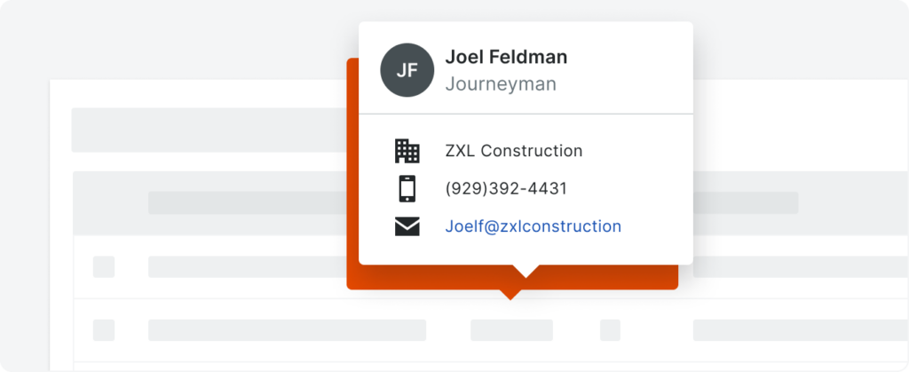
Popovers are interactive overlays that appear on top of webpage content, usually triggered by user actions like clicking a button or hovering over an element. These dynamic elements provide supplementary information, context, or functionality without requiring users to navigate away from the current page.
Popovers offers a non-intrusive way to deliver relevant content and enhance user engagement, and you commonly notice this feature for tooltips, notifications, or interactive forms.
Here are a few pointers to note:
- Customise with a suitable style, animation, and behaviour to align with your site’s aesthetic and usability goals.
- Consider where to place, how to time, and what the content relevance is before executing it.
- Use judiciously to avoid overwhelming users or disrupting their workflow.

8. Modals
The last trend in this list is the Modals. They are overlay windows that temporarily interrupt the user’s interaction with a webpage to display important information, gather input, or prompt actions. Experts commonly use them for tasks such as displaying images, confirming actions, or collecting user feedback.
However, note that excessive use of modals can disrupt the user flow and lead to frustration. So, it’s crucial to use modals sparingly and ensure their content is relevant, informative, and easy to dismiss. This maintains a seamless user experience while achieving the desired interaction goals.
Last Message:
Navigation is a crucial aspect of web design. Unless you are not serious about your website, it’s best to take the help of a professional web designer and get your navigation right. Make My Website is an excellent provider in this regard. In fact, it not only offers web design but also SEO services in Melbourne.
So, get in touch with MMW if you truly want your website to succeed.
- Unlock the Power of AI: Unveiling Innovative Ways to Earn Income Online
- How Database Monitoring Services Can Ensure Business Continuity
- Artificial Intelligence in SEO: Exploring Opportunities for Semantic SEO, Data-Driven Strategies, Link Building, and More
- New book is out! Business models in emerging technologies

