In our data-centric world, tools that visualize data effectively are of paramount significance. One such tool is the Pareto chart. In the following sections, we will explore the concept, importance, and utilization of Pareto charts in enhancing efficiency. Below, you can learn more about Pareto charts and their significance in the business landscape.
Understanding Pareto Charts and Their Significance
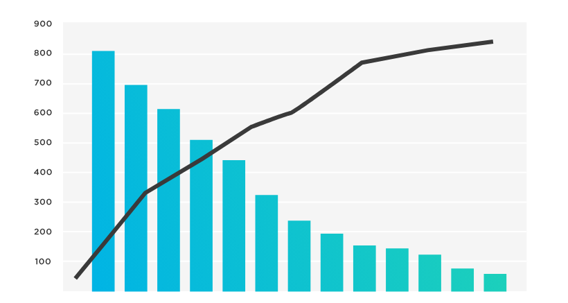
At its core, a Pareto chart is a type of bar graph, wherein individual values are plotted in descending order. Named after the Italian economist Vilfredo Pareto, it is rooted in the Pareto Principle, often known as the 80/20 rule.
It emphasizes the idea that roughly 80% of effects come from just 20% of causes. In the context of business, this could mean that 80% of sales come from 20% of clients. Hence, understanding this principle is crucial when approaching the interpretation of a Pareto chart.
One of the biggest advantages of Pareto charts is that they visually manifest this principle. This makes it easy for businesses to focus their attention on areas that can offer the largest potential for improvement.
Role of Pareto Charts in Boosting Process Efficiency
Pareto charts are invaluable when it comes to optimizing process efficiency. They allow businesses to pinpoint which processes or factors are contributing the most to a problem or an outcome.
By illustrating data in descending order, Pareto charts make it easy to prioritize tasks. With a quick look, decision-makers can identify key areas they need to focus on for improvement.
This can significantly enhance the decision-making process, leading to more informed and precise judgment. More importantly, it can bring forth remarkable improvements in the overall process efficiency.
While Pareto charts simplify complex data, they also help businesses cut through the noise, focusing only on information that holds the most value.
Steps To Create a Pareto Chart and Identify Improvement Areas
To build a Pareto chart requires thoughtful organization of data. The process starts with identifying and listing problems or issues to investigate.
These identified issues should then be translated into measurable units and embarked upon data collection. Metrics could be anything from the frequency of an occurrence to its impact or both.
Once you have sufficient data, it’s a matter of ranking data points in descending order and plotting them accordingly. This is typically done through spreadsheet software or specialized data visualization tools.
The resultant Pareto chart illustrates key problem areas which can then be drilled down into further improvement measures.
Practical Examples of Pareto Charts in Business Processes
Pareto charts are part and parcel of many business operations. Let’s consider a customer service center trying to minimize response time.
By applying the Pareto chart, the center can identify what types of concerns are time-consuming. Once identified, the company can focus on improving procedures or training for those specific types of concerns.
Another instance is in the field of product manufacturing. Pareto charts can highlight which parts of the manufacturing process cause the most product defects. This clear vision can prompt remedial action leading to enhanced product quality.

Overcoming Potential Limitations and Misinterpretations of Pareto Charts
Even though Pareto charts offer valuable insight, care should be taken while interpreting them. An oversight often seen is when businesses overlook the smaller bars, assuming them to be insignificant.
However, these small bars might signify overlooked issues that could escalate over time. Additionally, Pareto charts depend heavily on the quality and quantity of the data collected. Inadequate data can lead to skewed or misleading results.
Altogether, the Pareto chart stands as a powerful tool contributing to decision-making and process-efficiency improvement. With a comprehensive understanding of its interpretation and potential miscues, businesses can leverage this tool for continuous growth and enhancement.