In the vast landscape of data science, the ability to effectively communicate insights from data is paramount. As the digital world continues to evolve, data visualization emerges as a powerful tool, enabling us to distill complex information into easily understandable visuals. In this article, we delve into the realm of data visualization, focusing on its relevance to the burgeoning industry of white label crypto cards.
Understanding Data Visualization
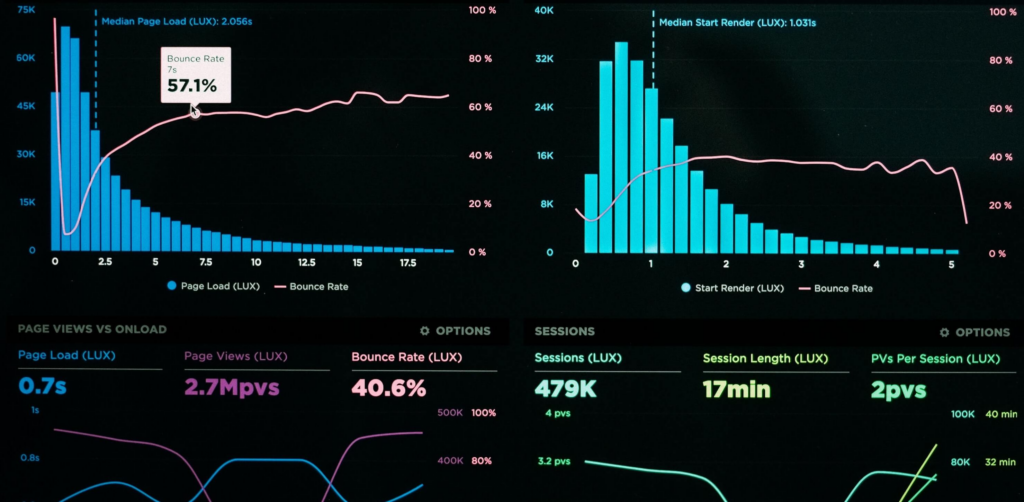
Data visualization is the art and science of presenting data in a visual format. By transforming raw data into graphical representations, such as charts, graphs, and maps, data visualization facilitates understanding, analysis, and decision-making. In the context of white label crypto cards, which offer customizable solutions for cryptocurrency transactions, effective visualization can provide valuable insights into user behavior, market trends, and transaction patterns.
Importance in the Crypto Cards Industry
In the dynamic world of cryptocurrency, where transactions occur at lightning speed across global markets, the ability to interpret data swiftly is essential. White label crypto cards, which allow businesses to brand and customize prepaid cards for cryptocurrency use, generate vast amounts of transactional data. By harnessing the power of data visualization, companies can gain a competitive edge by:
Tracking Transaction Trends:
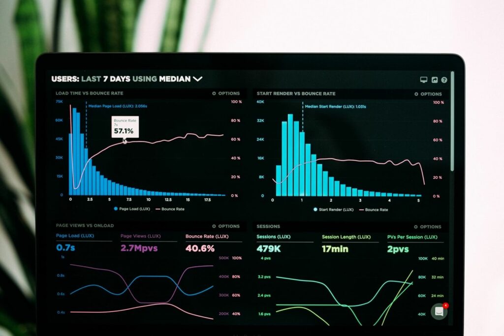
Visualizing transaction data enables businesses to identify patterns, trends, and anomalies in user behavior. By analyzing spending habits, transaction frequencies, and geographical distributions, companies can tailor their services to meet customer needs effectively.
Monitoring Market Performance:
Cryptocurrency markets are notoriously volatile, with prices fluctuating rapidly. Through visualizations such as candlestick charts and price heatmaps, stakeholders can monitor market performance in real-time, identify emerging trends, and make informed investment decisions.
Enhancing User Experience:
By presenting data in intuitive and interactive formats, such as dynamic dashboards and user-friendly interfaces, white label crypto card providers can enhance the user experience. Clear visualizations empower users to track their spending, monitor account balances, and manage their portfolios with ease.
Effective Visualization Techniques
To leverage the full potential of data visualization in the context of white label crypto cards, it is essential to employ effective techniques and tools:
Choose the Right Visualization:
Select visualizations that align with the nature of the data and the insights you aim to convey. For example, use line charts to track transaction volumes over time and pie charts to illustrate expenditure categories.
Keep it Simple:
Avoid clutter and complexity by focusing on the most relevant information. Use clean, uncluttered visuals that highlight key insights without overwhelming the viewer.
Add Context:
Provide context and interpretation to your visualizations through titles, labels, and annotations. Clearly articulate the story behind the data to ensure that viewers grasp its significance.
Utilize Interactive Elements:
Incorporate interactive elements, such as filters, tooltips, and drill-down capabilities, to engage users and encourage exploration. Interactive dashboards empower users to customize their visualizations and extract deeper insights.
Tools for Data Visualization
A plethora of tools and platforms are available to facilitate data visualization for white label crypto cards:
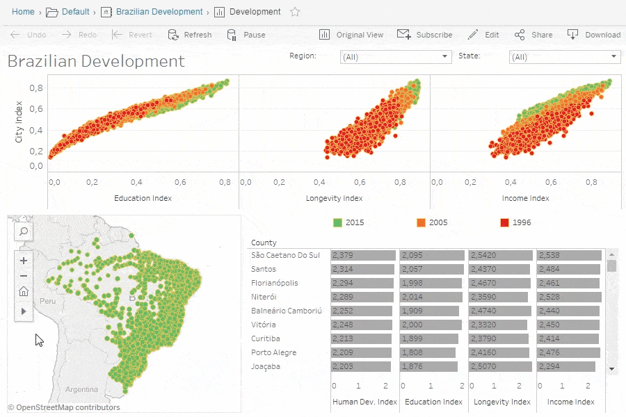
Tableau:
A versatile data visualization tool that offers a wide range of charts, graphs, and maps, along with intuitive drag-and-drop functionality.
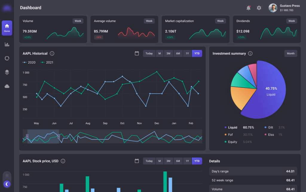
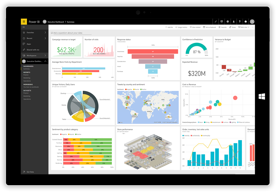
Power BI:
Microsoft’s business analytics platform that enables users to create interactive dashboards and reports from various data sources, including cryptocurrency transactions.
Plotly:
An open-source graphing library for Python and JavaScript that allows users to create interactive, publication-quality visualizations.
D3.js:
A JavaScript library for producing dynamic, interactive data visualizations in web browsers. D3.js offers extensive customization capabilities for creating bespoke visualizations.
Conclusion
In the fast-paced world of cryptocurrency and white label crypto cards, data visualization emerges as a critical tool for extracting insights, informing decisions, and enhancing user experiences. By leveraging effective visualization techniques and tools, businesses can unlock the full potential of their transactional data, gaining a competitive edge in this rapidly evolving industry. As we navigate the complexities of the digital economy, let data visualization serve as our guiding light, illuminating the path to innovation and success.
Ready to take your cryptocurrency trading to the next level?
Our tokenomics consulting services provide expert guidance to help you navigate the challenges of the crypto market and maximize your profits. From mastering risk management techniques to leveraging advanced tools like sentiment analysis, our team is here to support you every step of the way. Don’t let market tendencies dictate your success—partner with us and gain the knowledge and strategies you need to thrive in the world of crypto trading.
Contact us today to learn more and elevate your trading game!