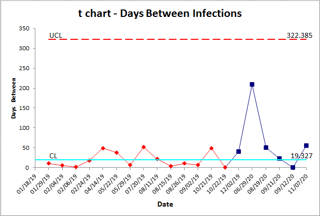
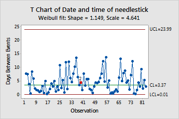
Data analysis is an essential tool for making informed decisions in various fields, from business and finance to healthcare and academia. To effectively analyze data, analysts use a wide range of techniques and tools, one of which is the T-chart. T-charts are powerful tools that can help simplify complex data sets, identify patterns, and make data-driven decisions. In this comprehensive overview, we’ll explore the power of T-charts in data analysis, their various types, and their practical applications.

What Are T-Charts?
T-charts, also known as T-distributions or Student’s T-distributions, are probability distributions commonly used in statistics and data analysis. Early 20th-century mathematician William Sealy Gosset created them, and they are particularly helpful when dealing with small sample sizes or when it is unknown what the population standard deviation is.
T-charts are symmetric and bell-shaped, similar to the normal distribution curve but with heavier tails. This feature makes T-charts better suited for estimating population parameters when dealing with limited data. The sample size affects a parameter known as degrees of freedom (df), which determines the shape of the T-chart. As the sample size increases, the t chart template approaches the standard normal distribution.
Types of T-Charts
There are several types of T-charts, each serving a specific purpose in data analysis. Here are some of the most common ones:
1. One-Sample T-Chart
The one-sample T-chart is used to compare the mean of a sample to a known or hypothesized population mean. It helps determine if there is a significant difference between the sample mean and the population mean. This type of T-chart is widely used in quality control and hypothesis testing.

2. Two-Sample T-Chart
The two-sample T-chart is used to compare the means of two independent samples. It helps assess whether there is a significant difference between the two sample means, which is crucial in various fields, such as A/B testing in marketing or clinical trials in healthcare.

3. Paired T-Chart
A paired T-chart, also known as a paired-sample or dependent T-chart, is used when dealing with paired data points. This type of T-chart is helpful when comparing the means of two related samples, such as before-and-after measurements in experiments or clinical studies.

4. Student’s T-Chart
The student’s T-chart is a fundamental T-chart used for estimating the population mean when the sample size is small (typically less than 30) and the population standard deviation is unknown. It is a versatile tool for data analysis and hypothesis testing.

The Power of T-Charts in Data Analysis
Now that we’ve covered the basics of T-charts, let’s explore why they are so powerful in data analysis:
1. Flexibility for Small Sample Sizes
T-charts are particularly valuable when working with small sample sizes. In such cases, the normal distribution may not be a suitable approximation, and the T-chart’s heavier tails provide more accurate estimates and reliable confidence intervals.
2. Handling Unknown Population Standard Deviation
In many real-world scenarios, the population standard deviation is unknown. T-charts are designed to work with both known and unknown standard deviations, making them versatile tools for data analysts. When the population standard deviation is unknown, T-charts use the sample standard deviation to make inferences about the population.
3. Robustness in Non-Normal Distributions
While the normal distribution assumes data follows a specific pattern, real-world data often deviates from this idealized model. T-charts are robust in the face of non-normal distributions, making them applicable in a wide range of situations.
4. Hypothesis Testing
Hypothesis testing is a fundamental aspect of data analysis, and T-charts play a pivotal role in this process. Analysts use T-charts to test hypotheses about population parameters, such as means, and determine whether observed differences are statistically significant.
5. Confidence Intervals
T-charts are instrumental in constructing confidence intervals, which provide a range of values within which the population parameter is likely to fall. These intervals help decision-makers assess the precision of their estimates and make informed choices.
Practical Applications of T-Charts
T-charts find applications in various fields and industries. Let’s explore some practical scenarios where T-charts are indispensable:
1. Quality Control in Manufacturing
Manufacturers use T-charts to monitor and maintain product quality. By regularly sampling products and analyzing the data using T-charts, they can detect deviations from quality standards and take corrective action.
2. A/B Testing in Marketing
Marketers employ T-charts to evaluate the effectiveness of different marketing strategies, advertisements, or website designs. A/B testing involves comparing user responses to two or more variations of a marketing asset to determine which one performs better.
3. Healthcare and Clinical Trials
In healthcare, T-charts are crucial for comparing the effectiveness of different treatments or therapies. Clinical trials use T-charts to assess whether a new drug or medical intervention has a significant impact compared to a control group.
4. Financial Analysis
Financial analysts use T-charts to assess the risk and return of investment portfolios. By comparing the performance of different assets or investment strategies, they can make data-driven decisions to maximize returns while managing risks.
5. Educational Assessment
Educational researchers and policymakers use T-charts to evaluate the effectiveness of teaching methods or curriculum changes. By analyzing student performance data, they can make evidence-based decisions to improve educational outcomes.
Steps to Create and Interpret T-Charts
Creating and interpreting T-charts involves several steps:
- Define the Problem: Clearly state the research question or problem you want to address with the T-chart analysis.
- Collect Data: Gather relevant data, ensuring that the sample size is appropriate for the analysis.
- Select the Type of Chart: Choose the appropriate type of T-chart based on your research question and the nature of your data.
- Set Significance Level: Determine the significance level (alpha) to use in hypothesis testing. Common values are 0.05 or 0.01, representing the probability of making a Type I error.
- Calculate Test Statistic: Calculate the T-statistic using the formula relevant to your chosen T-chart type.
- Determine Degrees of Freedom: Find the degrees of freedom (df) based on the sample size and type of chart.
- Compare to Critical Value or P-Value: Depending on your chosen significance level, compare the calculated T-statistic to the critical value from a T-table or calculate the p-value. If the calculated T-statistic exceeds the critical value or if the p-value is less than alpha, you can reject the null hypothesis.
- Draw Conclusions: Based on the comparison, draw conclusions about your research question. If you reject the null hypothesis, you may conclude that there is a statistically significant difference or effect.
- Construct Confidence Intervals: If applicable, construct confidence intervals to estimate the range within which the population parameter likely falls.
- Report Results: Communicate your findings clearly, providing relevant statistics and graphical representations if necessary.
Limitations of T-Charts
While T-charts are powerful tools, they do have limitations:
- Sensitive to Sample Size: T-charts become less necessary as sample sizes increase and approach infinity, as they converge towards the standard normal distribution.
- Assumes Normality: T-charts assume that the underlying data follows a normal distribution. If this assumption is severely violated, T-chart results may be unreliable.
- Requires Independence: These charts assume that data points are independent of each other. Violating this assumption can lead to incorrect results.
- Limited to Continuous Data: These charts are most suitable for analyzing continuous data. For categorical or ordinal data, other statistical tests may be more appropriate.
- Limited to Comparing Means: They are primarily used for comparing means, so they may not be the right choice for all types of data analysis.
Conclusion
T-charts are invaluable tools in the world of data analysis, offering flexibility, robustness, and the ability to draw meaningful conclusions from limited data. Whether you’re a quality control engineer, a marketing analyst, a healthcare researcher, or a financial planner, T-charts can help you make data-driven decisions and improve the quality of your work. Understanding how to create and interpret T-charts is a fundamental skill for any data analyst, and their power should not be underestimated in the quest for actionable insights from data.

